WhiteKnuckle to Jones Playing Cards- part 2
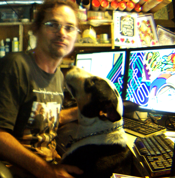
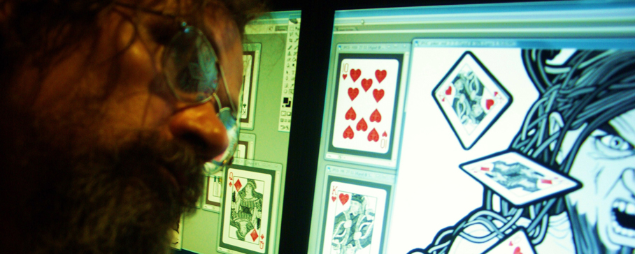
The primary design alteration from the WhiteKnuckle decks that I just had to carry out come hell or high water was the overall proportions (the 4mm edge gap issue). My weird heavily OC brain was never going to give me any peace until I'd republished the decks just for that one consideration alone. It was never lost on me I would also have the chance in the process of making whatever other adjustments and refinements to the designs while I was at it, unsurprisingly once I had begun the process an all but inevitable avalanche of large changes and myriad of minor tweaks crashed down around my artistic psyche like a burning helicopter, and the more I saw the more I saw (once you see you can't unsee) (figure 1).
fig 1: Head of studio security reporting in. He knew exactly where to find me for a good few solid years there.
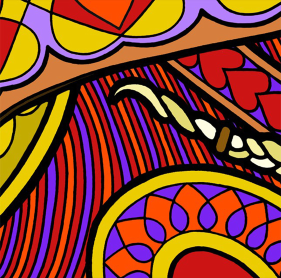
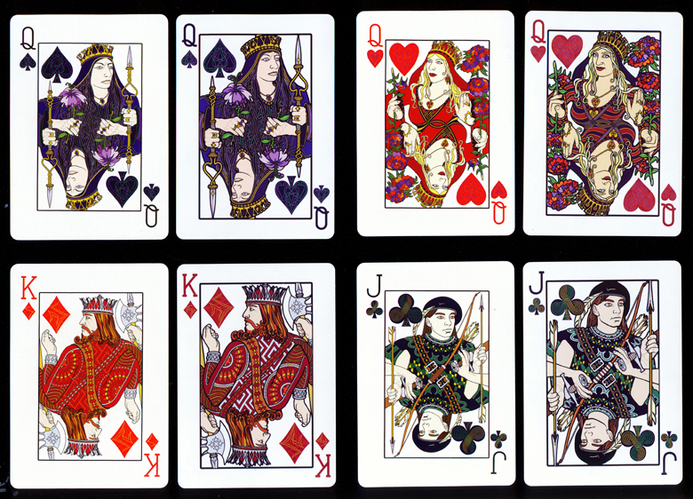
This led to seemingly endless sweeps back and forth through the deck to not only make whatever changes I wanted, but to make sure ALL refinements and alterations decided on were represented uniformly throughout the deck. Being all drawn entirely freehand made this quite a nerve wracking challenge (figures 2, 3, 4, & 5) although by this stage I had also learned through sheer attrition how to use a few more of the tools on Photoshop to help ease the way to some extent. I had graduated from Elements 2.0 to Photoshop CS2 for the JPC job, a lot better than stone age Elements but still a very old program. My computer was just too old and stupid to talk to any more recent .psd versions than CS2 but it was touch and go trying to get poor old CS2 to talk to USPCC's or LPCC's industry standard latest model Illustrator templates anyway, so it was very much a digital knife edge to balance on in either direction, especially for a digital idiot like me. The original WK designs took three years, the redesign took another six years, which is a pretty clear indicator of the vast array and intensity of the creative cage rattle involved in turning the old WK's into the four new JPC deck editions. A direct comparison of a few WK and JPC court cards tells the story very clearly (figure 6).
figs 2, 3, 4 & 5: Close detail crops of the Standard Colour Queen of Spades, Jack of Hearts, Jack of Clubs and King of Diamonds. At this magnification the designs look almost cartoonish but all that ever mattered from the beginning was how they looked and functioned as playing cards, at playing card size. It's interesting to see them this closely but it doesn't bear much relation to how they appear as playing cards. Every line, shape and colour choice was solely aimed at overall effect.
fig 6: These are scans of actual playing cards, done to allow direct comparison between the WK's (left card of each pair) and the JPC's (right card of each pair) and show the true extent of the design development and profound proportional and colour value improvements between the two decks. They really are two different animals altogether once you see them side by side. This image also shows the cooler, brighter white of Legend's Diamond Finish card stock compared to the warmer, mellower Bicycle 808 stock of the WhiteKnuckles.
Money Money Money
By the time I was getting close with the designs the important issue of exactly how much all this would cost and organising the necessary capital poked it's head up. A lot had changed since 2010, for one there was this new crowd funding concept I kept hearing about called Kickstarter, apparently supported by USPCC as part of their new 'custom deck program', neither of which really existed for the WhiteKnuckles. I'd been saving every cent possible from my magazine writing, workshop teaching, and WK sales for years but knew it still wasn't going to be enough to cover all costs of what I wanted to do once the currency difference (70c AUD- $1 USD), retail display boxes, DL 'more info' cards, freight from overseas, tariffs, duties, taxes, etc, etc were added to the actual cost of playing card production. We decided to give the Kickstarter thing a whirl, the studio manager looked right into it and quickly discovered it very much seemed heavily dependent on a social media presence to have any chance of success (Facebook/Twitter etc weren't around back in 2007 either). I've had the seaofpain.com website since the start of 2006 but had very intentionally never gone anywhere near social media. The constant back pain means I never have anywhere near enough time in each day already without becoming involved in the whole social media thing. I'd be an absolute shocker if I let that horse bolt, the day would be gonski and I would still be stuck on it, I'm always very all or nothing so it had to be nothing when it came to social media or I would never have had the necessary "every single available moment" for all the art/design/writing, I've always needed all the time there is and more to even come close to getting what I want done to adequately quieten my perennially screeching brain. The playing cards are just one of my all consuming clinical obsessions.
fig 7: The best thing that has ever happened to Sea of Pain Fine Art Productions was gaining a studio manager. Without her manifest input and efforts over the last couple of years I can honestly say I wouldn't be writing this story now as the playing cards would never have made it into production in this form (or possibly at all).
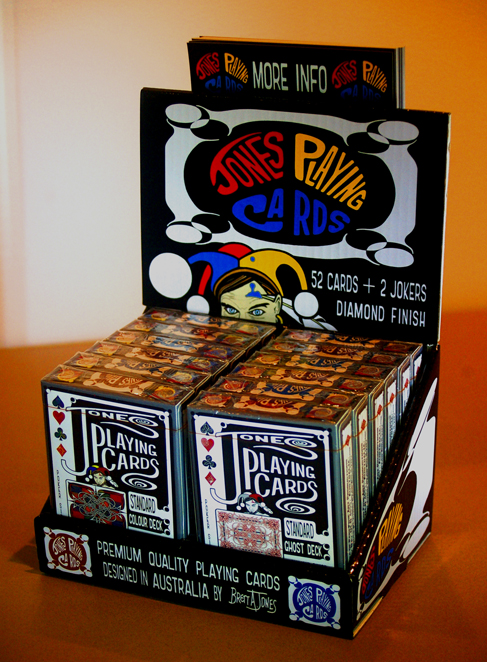
My studio manager Sharyn Klein (figure 7) took one for the team (she wasn't much into social media either) and established/built/maintained the Brett A. Jones/Jones Playing Cards facebook page specifically to 'get the word out there' leading up to actually launching our Kickstarter JPC project page (which she was also in charge of), not to mention the organising and acquisition of proper playing card retail display boxes which turned out to be a difficult and expensive addition to the project. It was all a huge undertaking for the uninitiated on top of the actual deck re-design work and of course all the many and varied non-card related projects always ongoing in the SOPFAP studio. I did my part by creating a heap of specific writing, images, lettering and graphics for FB, KS, and the display boxes (figure 8). We decided to try for a $30 000 goal on Kickstarter to help cover the cost of the project target back at that stage, namely manufacturing 10000 JPC Standard Colour decks and 10000 JPC Standard Ghost decks with USPCC (figure 9). We were up over $7000 by the time the 30 days ran out. We were always going to be investing a lot of our own capital in the project in one way or another, one of the most important elements of the whole concept as I saw it from the beginning was to keep the retail deck price as affordable as possible (under $10 USD/deck), the bigger the print edition the lower the unit price, wholesale price, retail price, etc. Unfortunately I think we just gave the impression that we didn't know what we were doing as we were first timers on KS and you just can't print 20K of decks with 30K of money (which was never the intent). We learnt that there had already been a large number of failed first time card deck projects on KS that had managed to attain their funding goal but hadn't fulfilled their end of the bargain to their pledgers, so the people familiar with such things already had their guard up by the time we threw our hat in the KS ring.
fig 8: A good retail display box was always going to be an essential part of the overall design brief for the Jones Playing Cards. Another of the studio manager's monumental contributions was to carry out all the research, groundwork, and communication in searching the world for a financially viable way to provide ourselves with the best possible counter-top display box to present the JPC decks. It was a great surprise to us both just how difficult it was to actually make into a reality. It substantially added to the overall cost of the JPC project but was an essential element to getting them out in the real world market.
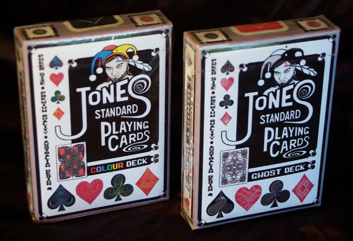
fig 9: This is what the two USPCC made Jones Playing Cards tuckboxes would have looked like if they'd gone ahead into production. The designs were changed and improved significantly between this stage and by the time we had re-worked them to suit the four deck versions on Diamond Finish cardstock ultimately manufactured by LPCC.
Crowd Funding Greenhorns
Hearing ourselves described as first timers got me curious, turns out the KS crowd funding concept has quickly evolved from a financial leg-up for artists and designers to get a good deck design or any creative idea off the ground commercially, into a cottage industry within itself. The general goal now seemed to be to raise just enough dough to cover the smallest print run of decks available (500-1000 decks depending on the particular manufacturer) which have a much higher unit price so a much higher retail price in order to have any hope of breaking even let alone making any kind of profit, with the longer term strategy seemingly being to continue churning out "collectible" decks one after another as quickly as possible. That whole concept was the complete opposite to what we were trying to do. You can call me an old school fool or just extremely slow but I never could or had any intention of continually producing small limited runs of expensive boutique decks, but rather take as long as it took to get my standard deck re-design exactly how I wanted it in every regard and then producing it in as large a print run as I could possibly afford by scratching together every single dollar I could get my hands on (putting everything in my life on the line, again), in order to make a beautiful and highly functional high quality brand of playing cards in their own right which was also as reasonably priced as possible (under $10/deck USD). They had to be able to be used, abused, and replaced with the surety of continuity (or in other words be permanently available as a brand of cards so if they became your favourite deck you could wear them out/love them to death knowing getting more decks wasn't ever going to be a problem into the future). I just couldn't see the point of investing all that time, effort and money if it could only be a one off 500- 800 deck edition with a prohibitively high unit price for anyone but diehard card collectors.
The Estonian Connection
The whole Kickstarter thing, despite not reaching its funding goal, was not only a good education in the current card scene (I had been paying zero attention up till then) but changed the entire course of the JPC project in a totally unexpected and ultimately excellent way. We received a personal message during our funding campaign from one of our pledgers (hi Victor) to check out another playing card deck project page which by astonishing co-incidence was an active project page on KS at the same time as ours. Two young Estonian lads living in Germany had "created" a deck design containing a blatant rip-off of the WhiteKnuckle court characters, we reacted instantly with hostile cease-and-desist emails to the "designers" and to their proposed manufacturers, Legends Playing Card Company. We never heard back from the Estonian youths (they pulled their KS project page down straight away due to as they very accurately put it "copyright issues") but we most certainly heard back from Lawrence Sullivan from LPCC with apologies and assurances that he would never intentionally infringe on anyone's copyrighted designs.
Wheels of Destiny
It was all meant to be I'm sure, we were just about to sign off on the legal indemnity on USPCC's 1.6mm die drift so production could begin. This time I had not just crossed their "art limit line" but pretty much ignored it altogether. I was more than willing to take the risk of the Jones Playing Cards indices being cropped in order to have them as close to the card edge as they just had to be in my mind's eye. They had sent us quite a few sample decks of various proprietary and custom Bicycle decks that all looked beautiful to me as far as die drift went so I was confident the risk was worth taking. While in communication with Lawrence Sullivan from LPCC over the Estonian debacle he told me they had a guaranteed die drift of only 0.2mm. Then I discovered their premium "Diamond Finish" cardstock was not only a brighter and cooler white colour which I liked very much (brighter white= brighter colours, you gotta love that Bezold Effect) and was also noticeably stiffer than the 808 bike stock, which I liked even more. I understand how highly regarded and loved the USPCC bike stock has always been but to me it always felt a bit softer and bendier than I imagined playing cards should be. The thought of stiffer/whiter cardstock with a beautiful satiny surface finish/texture and guaranteed near perfect placement of the designs on the cards in relation to the edges was just too good to pass up so we jumped the Pacific from Kentucky to Hong Kong and went straight into pre-production with Legends Playing Card Company. USPCC were not only fine about it, they were a pleasure to deal with on every level at every stage, efficient and professional. I would have no qualms about doing business with them again or recommending them to anyone crazy enough to want to design their own card deck and produce them.
Down to Brass Tacks
Before we made the final decision on jumping the puddle to LPCC I conducted extensive and rigorous experiments on all card stocks I had examples of here in the studio and carefully recorded the results so we'd be going into this massive unforseen change in direction with both eyes wide open. Oh boy did we learn some interesting facts after using precise engineering methods and equipment to measure and compare different aspects of all the various card stocks on offer. There were a lot of very interesting conclusions reached including the debunking of something I had read on the web, that is that all decks made in Taiwan suffer badly from bend-click whereas other decks don't. This is just not true. The fact is ALL decks from every single brand here in my collection came out of the tuckbox with NO snap-click and ALL decks had snap-click after a few hours in the right weather conditions. Put back in the tuckbox overnight every single deck went back to having NO click bend the next time you pulled it out. In some weather conditions or in air-conditioning decks don't develop click bend at all, so I'm pretty sure it's all predicated on changes in humidity (moisture content in the air) and temperature. There's a LOT of long standing myths and misconceptions out there I have heard over the years regarding the various card stocks and coatings/finishes which I now know the actual reality of (it's nice to blow the smoke away and know the actual truth of the matter). I'll be keeping the specifics to myself mostly as I just needed all knowledge required to make decisions regarding producing playing cards, not stir trouble or start arguments.
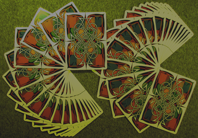
fig 10: A lot of thought went into making the colour cardbacks as spectacular as possible for fanning or any sort of deck manipulation. The coloured background being diagonally symmetrical means fanning looks quite different depending on direction.
Shine on you Crazy Diamond Finish
Not only was there no technical issues to be found to stop us going with LPCC's excellent Diamond Finish stock, I couldn't have been happier with the lengths Lawrence Sullivan went to regarding supplying me with necessary digital template versions and his patience when my old and slow-witted computer (still the one I bought in 2007 for the WK project) repeatedly refused to be friends with any of them. We had intended making the first two JPC decks (Standard Colour and Standard Ghost) both red-backs (figure 10) with a view to bringing out blue-back versions of both decks at some point in the future but after learning of the 10% discount offered by Legends if three deck editions were printed at the same time, decided to also do the JPC Standard Colour blue-back deck in the first blush.
Blue Ghosts as Well
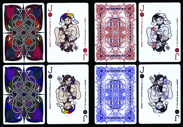
In the end we just bowed to the inevitable and went ahead with the JPC Standard Ghost blue-back as well (figure 11) and produced four 1st edition JPC deck models right from the start (3000 of each deck version, 12000 decks in all). We had to move more mountains to raise even more capital, I scratched together every cent I could find from the years of Australian WK sales, writing, teaching drawing workshops, and art sales that I had saved, and the studio manager stepped in and matched me dollar for dollar by taking a huge chunk out of her life savings and becoming an equal financial partner in JPC. In the final reckoning there wasn't much change (if any) out of $50 000 AUD ($35 000 USD). Despite that, doing the four decks just made so much sense on so many levels we just couldn't NOT do it once the idea was on the table in plain view. I knew it meant a lot more work again after I thought I had finally finished the years of relentless design work but I was already in insane overdrive mode so hooked in and not only developed the Blue Colour and Blue Ghost deck versions and tuckboxes but actually re-designed the 'finished' Ghost cardbacks as a whole on the strength of it. Then I took the opportunity (or it took me) to make "a last few touches" to the already massively reworked court cards which maybe unsurprisingly led to another big sweep of changes, modifications, and refinements both large and small to the whole court and the jokers (figures 12 & 13). A few of them actually changed in appearance quite radically in this last frenetic rush of deck development.
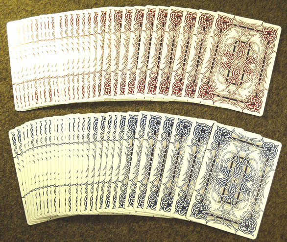
fig 11: JPC Standard Ghost redback on the top and JPC Standard Ghost blueback below, or as the friend I used as a model for the King of Spades calls them, "Blue Ghosts" (his favourite of the four decks). It seems to have stuck, we call them that too now. The grey in the background of both red and blue backs is the same, but the Bezold Effect makes the greys appear quite different, warm on the Red Ghosts and cool on the Blue's.
fig 12: The jokers didn't escape the ongoing series of radical improvements to all face cards even as we came up on pre-production period with LPCC.
fig 13: Hi-res scans of actual cards. On the left are the two JPC Standard Colour cardbacks and jokers, on the right the two Standard Ghost cardbacks with the ghost jokers.
Finished Shminished
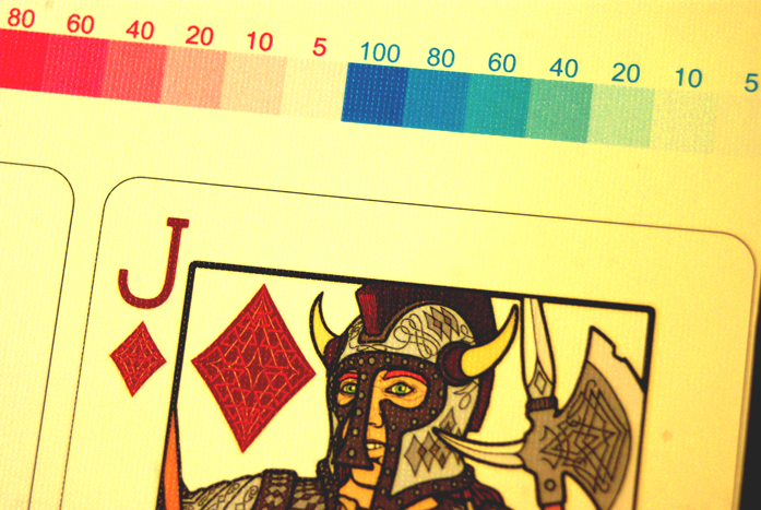
The entire "finally finished- or so I thought" deck and tuckbox designs were vastly improved in the lead up to Kickstarter, again during pre-production with USPCC and then again in the lead up to loading the digital card templates at LPCC (figures 14, 15, & 16). Looking back it was an impossibly intense time in the studio along with all the other ongoing writing, teaching, and drawing commitments and deadlines that are the norm at Sea of Pain Fine Art Productions. I really have no idea how I managed to get it all done at all let alone in time for the big exhibition launch at the end of 2016. From the very beginning back in 2007 until now there has been so many physical, psychological, technical, administrative, financial, and digital issues, ordeals, and outright nightmares it's really nothing short of a miracle that we have reached this point (the do or die mindset helped).
fig 14: Detail shot of the LPCC print proof sheet sent to us for final approval. Part of the Jack of Diamonds. Lines showing where the edge of the cards will be when cut are on the print proof only. Uncut sheets do not have this line.
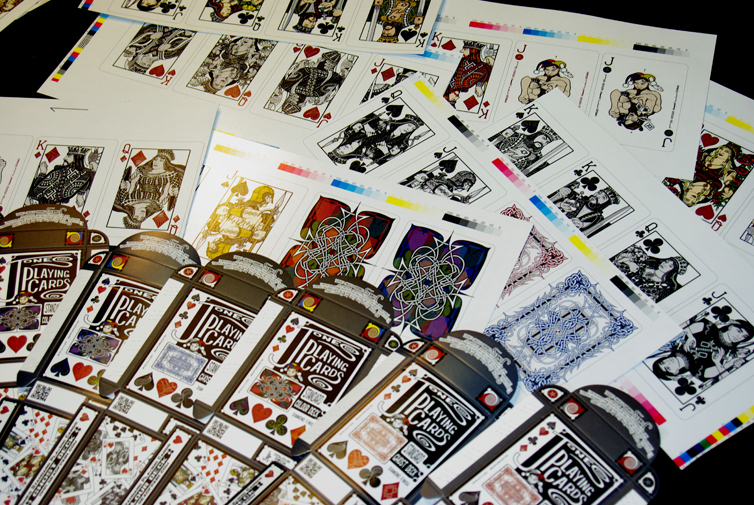
fig 15: Print proofs of all card designs, cardbacks, and tuckboxes.
Liquid Snowballs
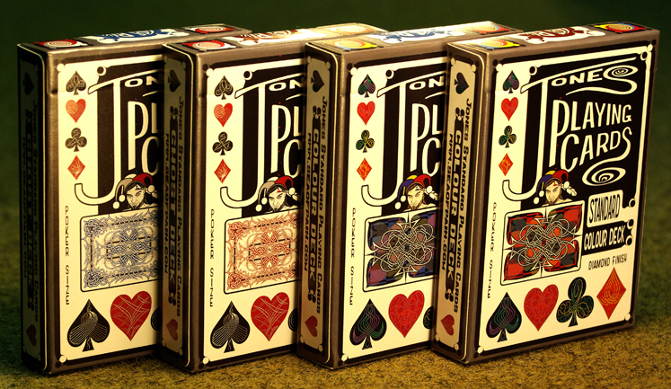
It would never have happened without the hands on support and endless organisation, communication and negotiation with the outside world from my studio manager Sharyn (AKA the Queen of Hearts, AKA the Cloud of Butterflies) which allowed me to stay in the background for extended periods completely immersed in nothing but the actual art, writing, and design. There's no way I could have done everything myself, not a snowball's chance in hell. So that's the saga of WK/JPC in a nutshell (figures 17, 18, & 19). A very expurgated version anyway, if I wrote it all down with all the many and various ups, downs, holdups, reversals, broken promises and utter nightmares encountered along the way included you'd either start sobbing in hysterical disbelief or die of boredom depending on your interest level in playing card minutiae.
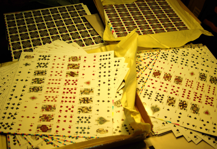
fig 16: Unwrapping the JPC uncut sheets for the first time. We ordered 3000 decks and 50 uncut sheets of each of the four deck versions. It was a grand milestone seeing them in reality for the first time after all the years of hard work staring fixedly at computer monitors with a sore back, eyes, and brain.
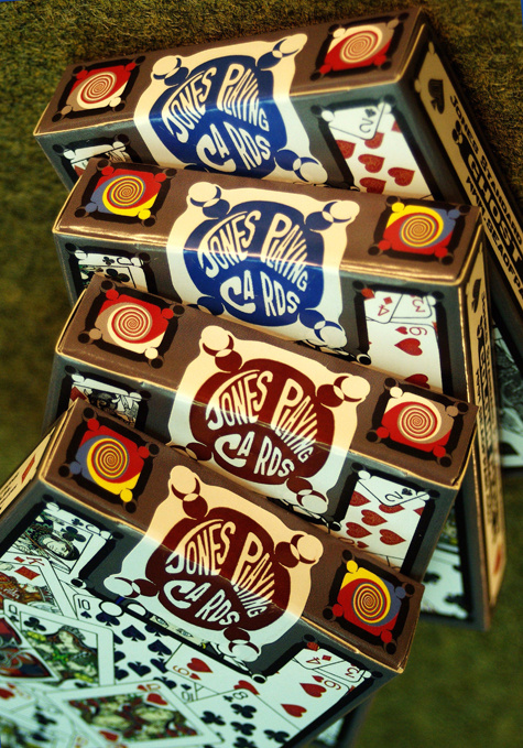
fig 17: The four JPC tuckboxes made by Legends without their cellophane wrappers, standing in a row. The graphic design was very much improved since the prototype mock-ups. We went with a satiny semi-gloss card stock. I was very impressed with not only the solidarity and quality of the tuckbox card stock used but also the structural design of the box itself. Legends makes fantastic tuckboxes, we very intentionally did not use any gilding or embossing mainly to keep the unit price as low as possible, but also to dodge anything that smelt of 'current trends' (standard practice at Sea of Pain).
fig 18: The four JPC decks showing LPCC's exquisitely cleanly cut card edges, just one of their outstanding manufacturing features. We extended the back design off the card edge at extremely carefully calculated points to create more interesting fanning visuals, the colour decks have one central line on each card edge, the ghost decks have 2 on each side. To ensure the absolute dimensional uniformity necessary to getting away with this I made sure the points that cross the edges are all accurate within one pixel over 600ppi (pixels per inch) within each actual design itself and then within one pixel during the loading of the digital card templates to avoid any danger of creating 'markable' cards. You'd have to have microscopic vision to use them to cheat at poker.
fig 19: The opportunity to design our own dedicated JPC tamper-proof deck seals was just too sweet to let go by so that job also became part of the pressure cooker ...I mean project.
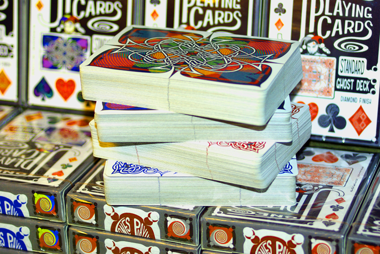
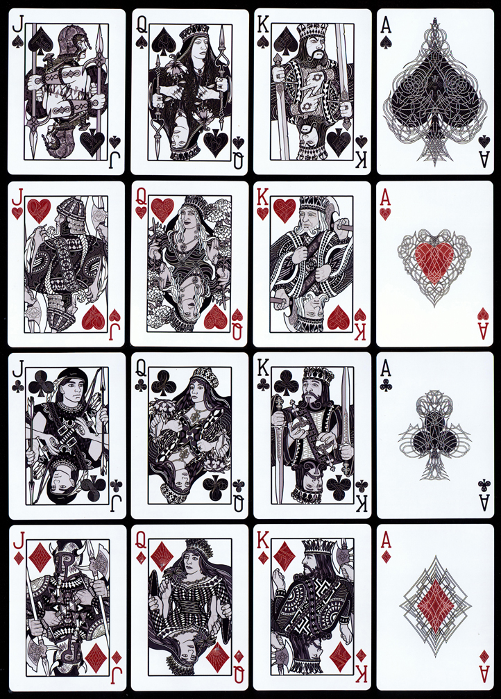
All that matters in my weird brain in the final wash-up is that the first four 1st edition Jones Playing Card decks have finally been successfully brought into physical existence (figures 20 & 21) and this time round I am extremely satisfied with every single aspect of them for the first time since the raw beginnings ten years ago, with the results actually matching (and exceeding) the mental image roasting in the glare of my mad mind's eye for a decade.
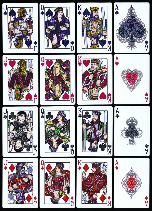
fig 20 & 21: Hi-res (600ppi) scans of the JPC Standard Ghost deck courts and aces. I tried very hard for quite awhile to take good enough digital camera images of them but the fine detail level, colours and tones are so subtle and crucial to the overall effect it proved impossible. These 600ppi scans of the actual JPC playing cards have really captured the visual truth of them.
We are already working on the next JPC deck designs with a clear vision of where the designs are heading but I think I'll keep the specific design details to myself for now. Watch this space, we're going again. We must be mad. Maybe you have to be to design playing cards.


